0

10 Usability Nightmares You Should Be Aware Of

10 Usability Nightmares You Should Be Aware Of 

How to make our sites or blog win in the search engine optimation and makes us top of the ranking.


by : Vitaly Friedman

Advertisement
Sometimes you just want to get the information you’re after, save it and move along. And you can’t. Usability nightmares — which are rather the daily routine than an exception — appear every now and again; usually almost every time you type your search keywords in Google. In his article “Why award-winning websites are so awful” Gerry McGovern points out that “the shiny surface wins awards, real substance wins customers” and that is absolutely true.
Create free stunning flash websites!Nevermind what design you have, and nevermind which functionality you have to offer — if your visitors don’t understand how they can get from point A to point B they won’t use your site. In almost every professional design (except from special design showcases such as, e.g., portfolios) you need to offer your visitors
  • a clear, self-explanatory navigation,
  • precise text-presentation,
  • search functionality and
  • visible and thought-out site structure.
And that means that you simply have to folow the basic rules of usability and common sense. You want to communicate with your visitors, don’t drive them away, right?
In this article we take a look at some of the usability nightmares you should avoid designing functional and usable web-sites. At the end of the article you’ll also find 8 usability check-points you should probably be aware of.

1. Hidden log-in link.

Backpack, 37signal’s one of the most usable organizational and project management tools out there, explains exactly what the tool can be used for, how one can use it and which features it has to offer. However, once you’ve signed up, you might need few minutes to find out what you should do to actually start using the tool.
Backpack in 10 Usability Nightmares You Should Be Aware Of
The “Log in”-link (hint: in the yellow box) should have a greater font-size — also icons would do the job. Every registered user has his/her own personalized page, however new registered users will need a while to find out how they can log in. As Lee in our comments said, “someone thats invested their time to sign up for a service will spend more than two seconds finding out how to log in.” Ok, but why should he/she? Why not just place the link somewhere where it’s visible? It sounds reasonable to us.

2. Pop-ups for content presentation.

Almost every modern web browser uses a popup-blocker to prevent pop-ups, ad blocks and further site content recognized as advertisement. Firefox, Safari, Opera and Internet Explorer make use of it — therefore the idea to use pop-ups to present the main content isn’t probably the most reasonable idea web-designer might come up with.

However, Adidas developers team seem to consider pop-ups as a creative approach for their target audience. It’s not clear what ImpossibleStory.com is actually about — most users will never find out; even we were too lazy to deactivate our popup-blocker.

3. Dragging instead of vertical navigation.

Actually, this technique — not a real nightmare, but very unusual — might become a new trend in the future. Dragging, as used from .pdf-documents, can also be adapted to web-sites. Fichey offers a Flash-based solution. Interesting approach, however you can’t bookmark specific parts of the site – a typical problem for Flash-based designs.
Fichey in 10 Usability Nightmares You Should Be Aware Of
An introductory info box on the start page of the site informs its visitors about the new way of navigation. The tool shows sites which are currently popular in social media. By the way, the displayed links don’t work – apparently, the tool shows the screenshots which are saved and embedded as images.

4. Invisible links.

Visitors have to know where they are, where they’ve been and where they can go next. If designers don’t present this information in an appropriate way, visitors can have serious problems with site navigation. Real Player had been using a bunch of invisible links for a while. Take a look at the picture and the labels below (originally created by Trenton Moss) — can you spot the links?
Realplayer in 10 Usability Nightmares You Should Be Aware Of
1, 3, 4, 6, 7 and 11 are links, and 2, 5, 8, 9 and 10 aren’t.

5. Visual noise.

Often less is more. Visual noise is probably one of the most typical problems large web-sites’ designers have to cope with. And it’s extremely easy to get it wrong. As Overstock does.
Overstock in 10 Usability Nightmares You Should Be Aware Of
Bonus: It’s also not quite clear what is a link and what’s not. Overstock also uses a number of different link presentations and hover effects. Link or not a link? You might have a lot of fun finding out.

6. Dead end.

You can use different approaches to introduce your new web-service to your visitors. Scriblink welcomes its visitors with a pop-up and a Java-applet. Visitors have to provide some input to start browsing through the site.
Scriblink in 10 Usability Nightmares You Should Be Aware Of
Nothing helps:
  • clicking on “cancel” doesn’t help,
  • OK doesn’t help,
  • full-screen mode doesn’t help,
  • clicking somewhere else doesn’t help,
  • closing the browser window doesn’t work,
  • clicking on the question mark for help doesn’t work.
Unfair, really. We just wanted to see what the tool does…

7. Content blocks layering upon each other.

A typical problem which always appears if large Flash-movies are used on large web-sites. The site navigation is hidden; whatever users might be willing to browse to — they have no chance.
Photoimpact in 10 Usability Nightmares You Should Be Aware Of
The same problem on Yahoo.com:
Yahoo in 10 Usability Nightmares You Should Be Aware Of

8. Dynamic navigation.

What looks like a usable site navigation, shows itself soon enough from its worst side. Nevermind where you point your mouse pointer to — supporting images slide down and up and change the focus of the link you’ve clicked on. On the image below the link “history” was clicked – it moves away; and no, the sliding images aren’t linked to the page you’d like to browse to.
Brownuni in 10 Usability Nightmares You Should Be Aware Of
The effect appears in both left- and right-side navigation menus. Visitors might need some time to find out what is happening. However, once the idea is understood, the navigation isn’t that hard to deal with.
Kabe243 in 10 Usability Nightmares You Should Be Aware Of
The same idea on Kabe243. Bonus: visual noise at its best.

9. Drop-Down Menus.

Drop-Down menus are useful for web-developers and almost always get on users’ nerves. If you — as a designer — hide navigation items in a drop-down menu you can save yourself a large amount of vertical space; however users have to focus the mouse precisely to get to the section they’d like to visit. It’s not usable.
However, it can be even worse. If the distance between different levels of navigation is too large (for instance because some navigation items have more text) users have to move the mouse horizontally. If the mouse focus changes its vertical position, users have to start from the beginning.
2Advanced and Brita.net are excellent examples for these usability nightmares.
2advanced in 10 Usability Nightmares You Should Be Aware Of
Brita in 10 Usability Nightmares You Should Be Aware Of
Notice: it took us a dozen of attempts to actually make these screenshots.

10. Blinking images.

Sometimes you just want to read the content of a web-site you are visiting. And you can’t. To fight against the banner blindness advertisers make use of animated ads — usually animated .gif-images or Flash-movies. In both cases it might become extremely hard to focus on reading if such images are blinking all around the content.
Digital Web Magazine, an excellent online magazine we read on a regular basis, has a disturbing animated ad on the left side of every article.
Digital-web in 10 Usability Nightmares You Should Be Aware Of

Future Nightmare?
Pointing the mouse instead of clicking.

Dontclick.it, an interesting experiment in interaction design, explores a clickfree environment. It wants to explore how and what changes for the user and the interface once you can’t rely on the habit of clicking.
Dontclickit in 10 Usability Nightmares You Should Be Aware Of
Within this interface you won’t find any buttons. Instead you navigate the contents in a different way — by pointing the mouse to the areas of the site you are interested in. What sounds like an interesting approach might soon become a usability nightmare – just imagine web-users trying to open external links in a new browser window; besides it’s interesting to know how exactly users will be able to, let’s say, open a list of links in new browser tabs (updated to clarify why we’ve put Dontclick.it in this post).

8 Usability Check-Points You Should Be Aware Of

  1. You don’t use pop-ups.
    Pop-ups interrupt the browsing session of the visitors and require an instant feedback. Respect your visitors.
  2. You don’t change users’ window size.
    The same argument as the one against pop-ups holds. Some browsers, e.g. Internet Explorer, saves the browser dimensions and uses them for further browser sessions. As Ben Bodien commented, “it’s just plain inconsiderate to assume that you know better than the user how their software environment should be configured?”
  3. You don’t use too small font sizes.
    Long passages are harder to read, and to read brief sentences readers need more time. It holds also for links, buttons, forms, search boxes and other elements. Good news — in Web 2.0 the opposite is the case.
  4. You don’t have unclear link text.
    Links have to be precise and lead to the destination they describe. Ambiguous link descriptions should be avoided.
  5. You don’t have dead links.
    There are too many of them anyway; why would you want to point your visitors to a dead end?
  6. You have at most one animation per page.
    If blinking images are wide-spread through the site, it’s extremely hard to focus on one single site element. Give your visitors an opportunity to perceive your content. Using animated ads, don’t place them right along your articles.
  7. You make it easy to contact you.
    Maybe because you just don’t want to be contacted, but If visitors do want to get in touch with you, but can’t find any contact information, you lose their interest and trust. Disastrous for online-shopping, a missed opportunity for the rest.
  8. Your links open in the same window.
    Visitors want to have control over everything what happens in their browser. If they’d like to open a link in a new window they will. If they don’t want to, they won’t. If your links open in a new window you make the decision which is not your decision to make.
Read more
0

Membuat Teks Berjalan di Menu Bar

Selain membuat teks berjalan di blog, anda juga bisa membuat teks berjalan di menu bar. Belum tahu apa itu menu bar? Nah itu loh teks yang berada dipojok paling atas layar dan di nav bar browser seperti yang ditunjukkan pada gambar dibawah ini.


Nah bagi anda yang ingin mencobanya. Silahkan ikuti langkah-langkah dibawah ini:

1. Login ke blogger
2. Pada menu Design -> Edit HTML
3. Letakkan kode dibawah ini diatas kode </head>

<script type='text/javascript'>
//<![CDATA[

msg = " -- Selamat datang di Simple Preview ";
msg = " | pernak-pernik blog -- " + msg;pos = 0;
function scrollMSG() {
document.title = msg.substring(pos, msg.length) + msg.substring(0, pos); pos++;
if (pos > msg.length) pos = 0
window.setTimeout("scrollMSG()",200);
}
scrollMSG();
//]]>
</script>

Ganti teks yang dicetak tebal dengan teks yang ingin anda tampilkan.
Angka 200 menunjukkan kecepatan gerak dari teks. Semakin kecil nilainya semakin cepat gerakan teksnya dan sebaliknya. Ganti bila perlu.

4. Jika sudah, klik Save Template. Selesai

Jika berhasil anda akan melihat teksnya berjalan di menu bar anda. Untuk lebih jelasnya bisa anda lihat hasilnya disini.
Read more
0

Cara membuat auto read more pada blogger

Membuat Auto Read More kali ini berbeda dengan yang sebelumnya yaitu cara memberi read more dan cara memberi read more pada posting. Cara membuat auto read more kali ini aku pelajari dari blognya Oom (o-om.com). Berhubung untuk menerapkan ilmunya aku tulis lagi cara membuat auto read more ini dengan tujuan memperfaseh dan memperluas berbagi informasi sesama blogger, khususnya cara membuat auto read more ini. Cara membuat auto read more kali ini agak ruet disbanding membuat read more sebelumnya. Membuat auto read more kali ini memang dibilang lebih praktis karena apa, jika read more terdahulu harus menggunakan cara manual untuk memasang fungsi auto read more tersebut ke setiap posting.

Tidak kalah menariknya fungsi auto read more kali ini mampu menampilkan gambar pertama dalam sebuah poting. Fungsi auto read more ini bisa dibilang lebih mirip dengan artikel terbaru dengan thumbnail.

Kelebihan yang lain dari fungsi auto read more kali ini yaitu kita bisa mengatur berapa banyak karakter yang akan ditampilkan. Ada karakter yang bisa ditampilkan jika ada sebuah gambar dalam postingan yang anda buat. Dan adapula yang tanpa menampilkan gambar. Memang cara membuat fungsi auto read more kali ini agak rumit tapi ada sisi positifnya juga yaitu kita tidak perlu lagi membuat fungsi read more pada setiap posting .

Cari kode </head> kemudian letakan script dibawah ini di atas kode </head> .
copy paste script auto read more barikut ini:

<script type='text/javascript'>
var thumbnail_mode = "float" ;
summary_noimg = 250;
summary_img = 250;
img_thumb_height = 120;
img_thumb_width = 120;
</script>


<script type='text/javascript'>
//<![CDATA[
/******************************************
Auto-readmore link script, version 2.0 (for blogspot)

(C)2008 by Anhvo

visit http://en.vietwebguide.com to get more cool hacks
********************************************/
function removeHtmlTag(strx,chop){
if(strx.indexOf("<")!=-1)
{
var s = strx.split("<");
for(var i=0;i<s.length;i++){
if(s[i].indexOf(">")!=-1){
s[i] = s[i].substring(s[i].indexOf(">")+1,s[i].length);
}
}
strx = s.join("");
}
chop = (chop < strx.length-1) ? chop : strx.length-2;
while(strx.charAt(chop-1)!=' ' && strx.indexOf(' ',chop)!=-1) chop++;
strx = strx.substring(0,chop-1);
return strx+'...';
}

function createSummaryAndThumb(pID){
var div = document.getElementById(pID);
var imgtag = "";
var img = div.getElementsByTagName("img");
var summ = summary_noimg;
if(img.length>=1) {
imgtag = '<span style="float:left; padding:0px 10px 5px 0px;"><img src="'+img[0].src+'" width="'+img_thumb_width+'px" height="'+img_thumb_height+'px"/></span>';
summ = summary_img;
}

var summary = imgtag + '<div>' + removeHtmlTag(div.innerHTML,summ) + '</div>';
div.innerHTML = summary;
}
//]]>
</script>

Tetap pada halaman EDIT HTML, Beri tanda centang pada "Expand widget template" kemudian cari kode dibawah ini

<data:post.body/>

Jika sudah ketemu, maka ganti kode <data:post.body/> dengan semua kode dibawah ini

<b:if cond='data:blog.pageType != "item"'>
<div expr:id='"summary" + data:post.id'><data:post.body/></div>
<script type='text/javascript'>createSummaryAndThumb("summary<data:post.id/>");</script>
<span class='rmlink' style='float:left'><a expr:href='data:post.url'>READ MORE - <data:post.title/></a></span>
</b:if>
<b:if cond='data:blog.pageType == &quot;item&quot;'><data:post.body/></b:if>

Setelah selesai tekan save template.

Keterangan tentang cara membuat auto read more:
var thumbnail_mode = "float"; (kita dapat memutuskan apakah letak thumbnail berada di (float) kiri atau jika tidak silahkan ganti dengan (no-float)
summary_noimg = 250; (Menetapkan berapa banyak karakter akan ditampilkan di posting tanpa gambar / thumbnail)
summary_img = 250; (Menetapkan berapa banyak karakter akan ditampilkan di posting dengan gambar / thumbnail)
img_thumb_height = 120; (Thumbnail 'tinggi dalam piksel)
img_thumb_width = 120; (Thumbnail 'lebar dalam piksel).

Dengan keterangan di atas anda dapat merubah script fungsi auto read more sesuka hati.
Selamat bereksperimen…
Read more
0

Cara Menampilkan Status Offline/Online Yahoo Messenger

Dalam Postingan kali ini kita akan coba membahas tentang "Bagaimana Cara Menampilkan Status Offline/Online Yahoo Messenger". fungsi dan tujuannya tuh agar pengunjung blog sobat akan bisa langsung berinteraksi langsung dengan sobat, kalo gitu kan nanti pengunjung blog sobat jadi tambah gampang komunikasi sama sobat.

Contohnya akan seperti ini, jika status sobat offline maka gambarnya akan seperti ini :


Kemudian jika sobat online maka iconya akan berubah seperti ini:


Cara buatnya sangat gampang sobat tinggal copy script berikut ini trus kamu pasang di sidebar kamu, udah tahu kan cara pasanganya, itu lho seperti kalo km masang "page element", Masuk ke "Page Element" trus "Add a Gadget --> HTML/Javascript".

<a href="ymsgr:sendIM?Abd_roqib"> <img src="http://opi.yahoo.com/online?u=Abd_roqib&amp;m=g&amp;t=2&amp;l=us"/>
</a>


Ganti text yang warna merah (Abd_roqib) dengan id YM sobat.
perhatikan angka "2", itu bisa kamu ganti dengan angka yang lain dan hasilnya gambar yang ditampilkan akan berbeda-beda.
selamat mencoba....
Read more
0

Cara membuat kotak teks (text area) di dalam postingan blog

Terkadang di dalam postingan kita ingin buat kotak teks (text area), di dalam kotak teks bisa diisi dengan teks, link, banner, dll. Ada banyak cara / script yang bisa anda gunakan untuk membuat kotak teks (text box) tersebut. Kotak teks ini biasanya digunakan untuk membuat form untuk tukaran link dengan blog lain.Sebagai contoh di bawah ini adalah beberapa macam cara membuat kotak teks (text box) dengan script yang berbeda.


Contoh 1:
* Teks rata tengah = text-align: center; center bisa diganti dengan left, right,justify
* Background warna biru = background-color: rgb(0, 0, 240)  angaka 0 dan 240 bisa anda ubah sesuai keinginan (untuk mengubah warnanya)

Script: (dimasukkan di dalam postingan)


Hasilnya:


Contoh 2:
* Teks otomatis rata kiri
* Background warna hitam = background-color: black; black bisa diganti dengan warna lain seperti white, red, blue, green, dsb, warna lainnya bisa dilihat disini daftar warna
* Link diisi hingga baris pertama penuh kemudian akan berpindah ke baris 2
*Tinggi kotak teks  100 px (pixel) = height: 100px; angka 100 bisa diubah sesuai kebutuhan

Script: (dimasukkan di dalam postingan)


Hasil:


Contoh 3:

* Teks otomatis rata kiri
* Background transparan
* Link diisi per baris 1 link
*Tinggi kotak teks  200 px (pixel) = height: 100px; angka 100 bisa diubah sesuai kebutuhan
 Script: (dimasukkan di dalam postingan)


Hasil:


kode di atas dimasukkan saat membuat entri baru / edit entri dalam mode "Edit HTML"


Mudah-mudahan postingan ini bisa menjawab pertanyaan teman-teman yang sering menanyakan cara membuat form tukaran link di dalam postingan. Pertanyaan seperti ini sudah sering saya terima lewat email, namun baru sempat membuat postingannya. agar lebih memudahkan menjawab pertanyaan teman-teman. Jika masih ada yang kurang jelas silahkan di tanyakan di kotak komentar.
Read more
0

Menambah Gadget/Elemen Halaman di Header Blog

Template defaulf atau bawaan blogger/blogspot maupun beberapa tempate dari situs penyedia template gratis, pada bagian header biasanya tak ada menu 'Add Widget/Tambah Elemen'. Nah, bagaimana cara menambah widget atau elemen halaman di header blog? (misalnya mau dipasang skrip iklan, gambar/foto, link, dll). Ternyata caranya gampang. Simak tutorial berikut ini:

1. Masuk Dashbor, Layout/Tata Letak, edit HTML
2. Beri centang pada Expand Template Widget
3. Cari kode showaddelement
4. Ganti kode showaddelement='no' dengan showaddelement='yes'
5. Ganti angka 1 pada kode maxwidgets='1' dengan angka sesuai jumlah elemen halaman/gadget yang ingin ditempatkan di header.
6. Selesai.

Ini contoh header sebelum dan sesudah ditambahkan gadget.

Sebelum:


Sesudah:


Akhirnya, Yu Painten tuku telo. Cekap semanten postingan kulo (cukup sekian postingan saya). Selamat mencoba dan salam ngeblog.
Read more
0

Menu Navigasi Dalam Navigasi Bar (Navbar)

kita akan belajar membuat navigasi bar (navbar) blogger menu sederhana,seperti kasus diatas.

Jadi,bukan hanya membuat sebuah navbar,melainkan membuat 'menu navigasi' di dalam navbar itu sendiri.
Bingung?

Contoh hasil dari kreasi navbar ini,bisa anda lihat seperti gambar di bawah ini [klik gambar untuk hasil yang lebih besar]:


Navigasi Bar / Navbar Blogger


Sedangkan jika anda ingin memastikan seperti apa sih hasil sebenarnya,silakan kunjungi situsnya langsung di SINI.
Bagaimana? tertarik untuk membuatnya?

Langkah Membuat Navbar Blogger Sederhana


Sesederhana judul artikel ini,penempatan barisan kode css maupun kode untuk navbarnya,sangat sederhana sekali.
Sekali lagi,tutorial membuat navbar ini hanyauntuk blogspot dari blogger saja ya :p


Pertama,Pergilah ke Dashboard blogger anda,lalu pilih Tata Letak,selanjutnya seperti biasa pilih tab Edit HTML.
Selanjutnya,contreng tulisan Expand Widget Templates.
Lalu cari kode berikut:


[untuk membantu,carilah menggunakan keyboard dengan menekan tombol alt+F]

Setelah ketemu,letakkan kode css berikut persis di atas kode  tersebut.


Jika sudah anda letakkan kodenya css-nya,sekarang cari lagi kode berikut:


Jika sudah ketemu,letakkan kode berikut persis di bawahnya.


Setelah itu Simpan Template,dan lihat hasilnya sekarang :D

Keterangan:
  • Untuk tanda #,gantilah dengan url alamat yang ingin anda tuju.
  • Untuk http://www.awsurveys.com/HomeMain.cfm?RefID=pujiantoro,gantilah dengan alamat iklan banner anda.
  • Untuk http://www.awsurveys.com/Pictures/AWS_ad3_150by150.jpg,gantilah dengan url gambar banner anda.
  • Untuk http://url_blog_anda.blogspot.com/,gantilah dengan url blog anda.
Semoga bermanfaat dan modifikasilah sesuai selera anda masing-masing.
Goosd Luck Ya!


Read more
0

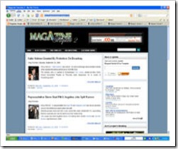
FREE Template : Magazine Template 2


magazine2Setelah satu minggu kang Rohman berpuasa untuk posting di blog ini, akhirnya saya sempatkan juga mampir di sini agar para pengunjung tidak merasa jemu dengan tampilan blog Kang Rohman yang tulisannya itu itu melulu tiap hari.

Namun, hari ini pun bukan mau nulis tentang tutorial tapi mau bagi-bagi template. Nah, template yang akan saya bagi-bagi gratis ini di beri nama " Magazine Template 2 ", karena template yang dulu namanya " Magazine template 1 ". bener ngga ya sehabis 1 itu 2? hihihi...

Yang mau lihat demonya, silahkan kunjungi http://magazinetemplate2.blogspot.com

Bagi anda yang berminat dengan template ini, silahkan download. Namun tolong hargai hasil kerja saya dengantidak menghapus link credit yang ada di footer template tersebut. Anda tidak suka dengan link tersebut? silahkan jangan pake template buatan saya.

Apabila anda menginginkan full support dari saya tentang template ini, silahkan kirimkan donasi Via Paypal atau Bank BCA. Bagi yang gratisan, mohon maaf! silahkan berusaha sendiri karena saya pun harus mengerjakan kegiatan yang lain untuk menghidupi keluarga saya.

Tidak sabar ingin mendownload? silahkan download di sini! atau disini!

Read more
0

Membuat Baner Animasi


Agar blog kita tampil dinamis dan lebih atraktif, salah satu caranya adalah dengan memajang banner animasi.karena dengan banner animasi, mata dari pengunjung akan langsung tertuju kepada banner tersebut, terutama apabila anda seorang pebisnis, banner animasi akan lebih efektif untuk iklan yang kita pasang di banding dengan banner biasa. Cara membuat banner animasi sangatlah mudah, mau yang gratisan ada, mau yang bayar juga ada.Tapi tentunya ada kelebihan dan kekurangannya.

bagi anda yang berminat dengan banner animasi gratis, anda bisa kunjungi http://www.addesigner.comSilahkan daftar (gratis), Jika sudah di terima anda tinggal memilih banner yang di sediakan, trus ya tinggal di masukin ke blog, mau di sidebar atau di dalam postingan tentu bisa. Untuk cara pemasangan silahkan anda baca postingan terdahulu bagaimana cara memasukan kode HTML kedalam blog.

Contoh banner animasi :


selamat mencoba.
Read more
0

Pasang Jam Di SideBar

Agar blog anda tampak cantik dan menarik untuk di lihat, maka anda bisa memasang beberapa aksesori blog, salah satunya adalah dengan cara memasang jam. Jam ini bisa anda dapatkan secara gratispada situshttp://www.clocklink.com. Salah satu contoh jam yang tersedia adalah sebagai berikut :


Dan bagi anda yang ingin blognya di pasang jamjuga, silahkan ikuti langkah-langkah berikut :

  1. Silahkan kunjungi situs http://www.clocklink.com
  2. Jika sudah berada pada situs tersebut, silahkan klik tulisan Want a clock on your Website ?
  3. Silahkan anda melihat-lihat dulu model dari jam yang tersedia, yaitu mulai dari Analog, Animal, Animation, dll
  4. Jika di rasa sudah menemukan model jam yang anda sukai, klik tulisan View HTML tag yang berada di bawah jam yang anda sukai tadi
  5. Klik tombol yang bertuliskan Accept
  6. Pilih waktu yang sesuai dengan tempat anda di samping tulisan TimeZone. Contoh : untuk indonesia bagian barat pilih GMT +7:00
  7. Set ukuran jam yang anda sukai di samping tulisan size
  8. Copy kode HTML yang di berikan pada notepad
  9. Paste kode HTML yang di copy tadi pada tempat yang anda inginkan
  10. Selesai


Karena kode jam blog ini adalah merupakan suatu kode HTML, maka bagi anda yang masih bingung cara menempatkan kode HTML pada template blog, silahkan baca kembali postingan saya terdahulu
di sini

Selamat mencoba.
Read more